MILO Launch Material
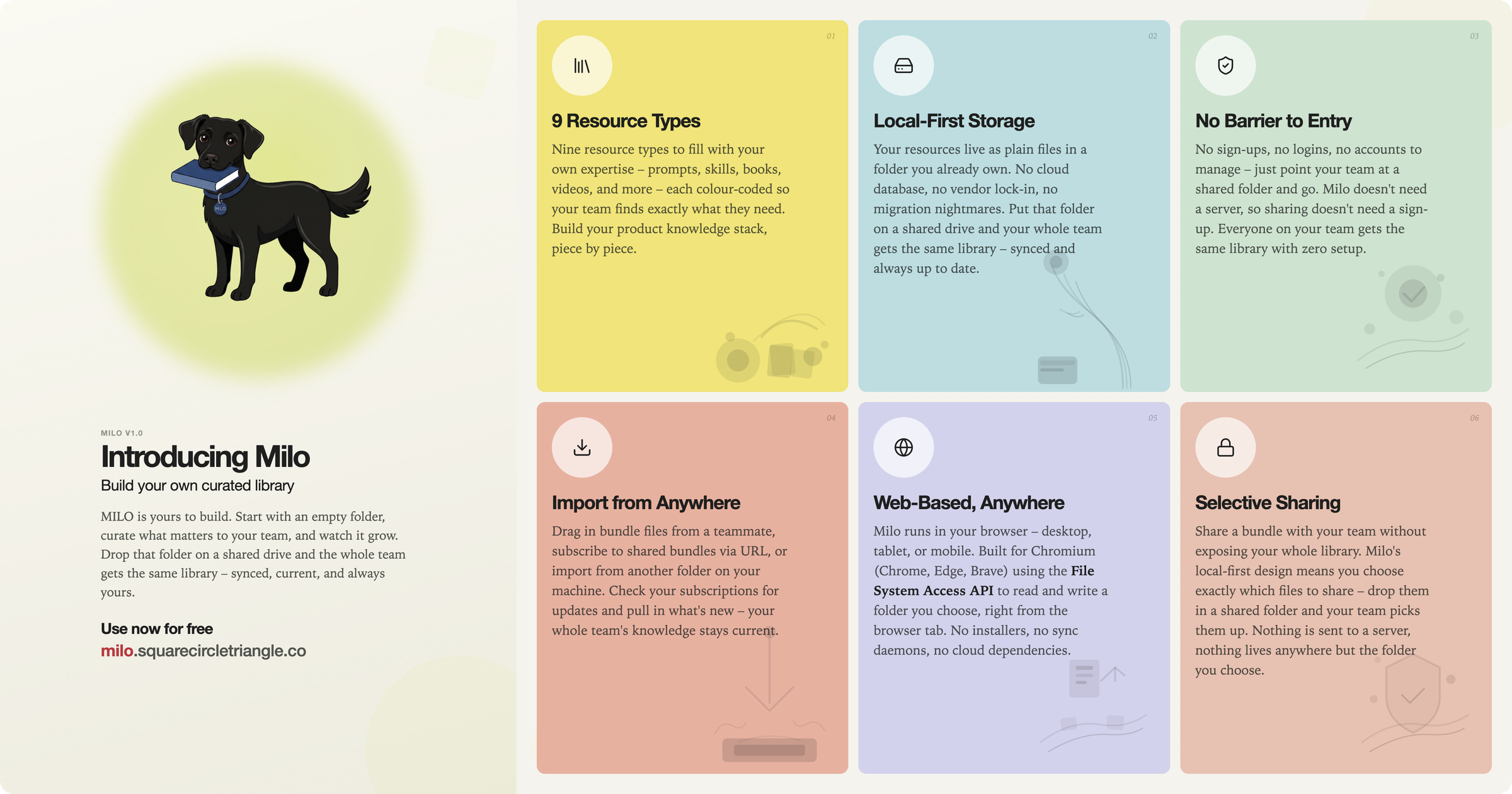
Two polished launch assets for MILO (Methods, Instructions, Learning & Operations) – a private, local-first resource library for product managers.
"Going Loud with MILO" – The flagship hero card. A stacked-card layout with three feature panels (Home, Discover, Library) that visually teases the product's core screens. The headline plays on the product's name, framing MILO as the loud, confident voice in your toolkit.
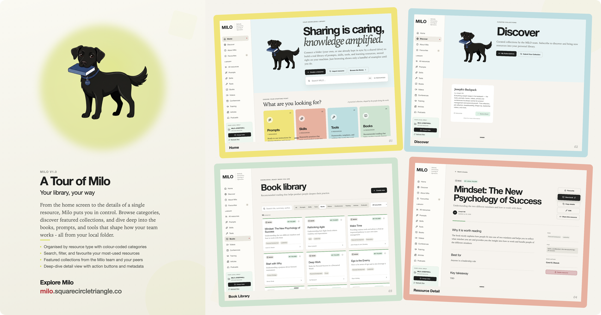
"A Tour of MILO" – The exploration card. Four slightly rotated screenshot panels (Home, Discover, Library, Detail) invite the viewer to click and explore. The "curated" framing was iterated out in favour of "featured content" after user feedback, reflecting the team's commitment to editorial quality.
Both assets went through six rounds of visual refinement:
1. Card layout and screenshot sizing (padding → full-bleed)
2. Border thickness (5px → 8px → 12px → 24px)
3. Distinct panel rotations per card
4. Body padding removal to eliminate whitespace bleed
5. Text corrections (em dashes out, "curated" → "featured")
6. Final alpha-channel mask for rounded-corner transparency
The assets live on Proton Drive and were delivered directly into the collaboration thread for stakeholder sign-off.
Key learnings from this process: Browser PNG captures don't support transparency - always post-process with PIL for rounded corners. Lock `html`/`body` width, height, and overflow before rendering to prevent whitespace bleed. Anticipate rotation, padding, and corner issues in the first iteration rather than fixing them in round 5. The Discord feedback loop works best when each iteration addresses exactly one visual concern at a time. For future brand assets, the dimension lock and PIL mask should be applied before the first render, not as bug fixes at the end.
Assets